![](https://blogger.googleusercontent.com/img/b/R29vZ2xl/AVvXsEgaCYTLLelwe1L2bDxPgbE9xH-6JHQKUf62o67OoUpxXutWht8NNf5N4NMdgA4dyNrNVn6a-qrFflZUZnW5Hot9qoLQER-4AaaeIl3njBVVNGNz8W4Exo3jmSSqDIOv3-ihdulVktAcDAk/s320/mayhem+2+small.jpg)
Been looking at club flyers for a while now and often see flyers which are jam packed with too many colour schemes, different fonts and pictures.
Just designed this (above) using various free fonts and brushes trying to keep it simple using only two fonts and 2 colours. Click for larger image.
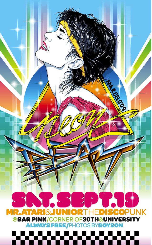
Some others which caught my attention
![](http://farm4.static.flickr.com/3492/3927764179_b02fc4a7de_b.jpg)
![](http://farm3.static.flickr.com/2445/3914037526_067b1154df_b.jpg)
![](http://farm3.static.flickr.com/2546/3715815127_5d3d8b09f6_b.jpg)
![](http://farm3.static.flickr.com/2546/3715841749_bdbbff814d_b.jpg)
Check out more here
No comments:
Post a Comment